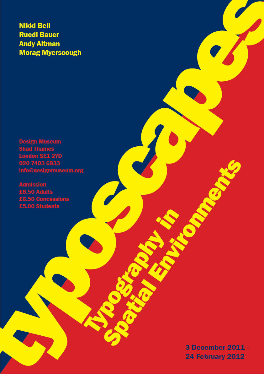
Poster 1 works better than poster 2 as the names are the same size. I would keep the type on the right ranged left. Couple of spelling mistakes: Typescapes and Spatial. Poster 3 is strong, but not sure about making the counter with centred type. Poster 4 is a bit busy. Poster 5 – interesting use of grid, but no date. Poster 6 (Mondrian) – perhaps a bit too busy. Poster 7 quite strong but maybe keep the Spatial Environments lined through. Well done Tim. Tony


Poster 1 works better than poster 2 as the names are the same size. I would keep the type on the right ranged left. Couple of spelling mistakes: Typescapes and Spatial. Poster 3 is strong, but not sure about making the counter with centred type. Poster 4 is a bit busy. Poster 5 – interesting use of grid, but no date. Poster 6 (Mondrian) – perhaps a bit too busy. Poster 7 quite strong but maybe keep the Spatial Environments lined through. Well done Tim. Tony
ReplyDelete