Julie Rezac is a lettercutter - a job description for a person who cuts letters in stone. But Julie is also an artist. These two disciplines combine in her work to create finely-crafted and unique lettered stones. I came in contact with Julie a year or two ago, when she cut the name of one of my daughters, Lizzie, into a beach stone. You won't find anyone more warm and kind than Julie. She had some great things to say about her work and letters, so read and enjoy.

Tim: Hello Julie, I haven’t got millions of questions for you, mainly because I’m conscious of taking up your time, so we’ll just see how it goes. Can I ask you, first of all, for a short history of how you came to be a letter cutter. I usually, I find that other questions come out of the answers.
Julie: Well, I started working in printing when I was going to university. I really loved it and I loved letters and especially I loved working with typography. So if we got a job in, where I could fiddle around with the typesetting, I’d have a wonderful time. And then I went to Ireland and lived there for about three years. I started going to the old graveyards that are in Ireland and I really loved them and found the lettering on them so beautiful, where I’d been used to American graveyards, where they all looked very sterile and everything looked much the same really – like a bunch of dominos in a row – and I wondered why these stones were so different and how the gravestones in America were so modern and ugly. I found out that the ones in Ireland were made by hand and I just had this sort of moment where I thought.... “This is what I’m going to do; this is what I want to do.” And then, when I was back in America, I tried to find someone who did that – I just assumed people did that! – But I couldn’t find anyone who still did hand lettering. And then I remember, I was in a library one time and I found a book written by David Kindersley. I decided to write him a letter, after I realised that he still had a working workshop. I didn’t know anything about him, except that I’d looked through that book and I’d found it really exciting, but I asked him if I could come and learn from him. I didn’t really expect any kind of answer at all, but I got a letter back that said “Yes please, can you come in a few weeks”
Tim: Where was this.....?
Julie: Cambridge.... And the deal was that I would take care of his children, part-time and then learn part-time. So, they basically needed a nanny, but I was happy to do it.
Tim: How old were you then?
Julie: Oh, I’m terrible at remembering my life, but I think I was about 26 or so.
Tim: So you’d been to Art College by this stage?
Julie: Yes I’d been to university and I was one of these people who absolutely didn’t know what to study. I liked English literature, so I studied that; I studied art etc. In America you can switch around and study different things, whereas in England, you have to be much more on a single track and so what I ended up with was studying liberal arts, where you learned a little bit about a lot of things, but not that much about anything (she laughs). And, in fact, I still had not quite a year to finish my degree and I quit, because I just thought “This is useless.” Of course now I regret that, but you make the decisions you have to at the time and that was when I went off to Ireland. Yeah, so that’s my story.

Tim: Can you tell me a bit about what the apprenticeship was like....
Julie: Well, you know, things always sound good on paper! David Kindersley was already, at that point, very old (in his eighties) and he had a wife who was bit older than I was. She was his third wife and you know, I really learned more from Lida than from David. My first project was that I had to just sit down, with no schooling from them, and David asked me to make an alphabet for him, in capitals. And so, in my unschooled way, I drew out my own 3 inch high letters, in Roman capital, and then he came and worked with me and corrected all the things which I done wrongly and even laughed at some of the funny curlycues I put on stuff and whatever, but he showed me from my unschooled letter, how the correct letter is made and I think that was a really good exercise, because I’d put myself into that and I could then see how I had to change that, you know. I’d invested something in it and I had my own notion of what might be a ‘K’ and then I realised that actually the ‘K’ needed to be more like this. He’d often say.... “Well, you could do it that way, but we do it like this!” He told me that all alphabets are based on the Roman capital and you have to know that in order to be able to do anything else. I think it’s because the Roman capital is such a pure family of letters, that they are all so completely harmonious with each other, you know, so that there isn’t a single letter that doesn’t fit the sequence. And, if you learn that, you can learn to do other stuff.
Tim: And how long did it take to perfect that?
Julie: Well, we worked on that for a few weeks, I suppose, because I was just working mornings and then I’d take care of the kids. And then, my next project, was to make a stone using the Roman capital, but he didn’t just want any stone. He told me to “make a design!” So I made a design with a large ‘A’ and then a little b, c, d etc and then a large ‘Z’ at the end. And that was just like learning a technique, as you might learn to bake a cake or something like that. Just like with wood carving, it’s the feel, or with pottery, it takes practice. And, you know, at first I was really scared and tentative, but just through years of practice, you get better. To mention Lida again, as she helped me much more – and she was also an excellent letter cutter.
Tim: And what stone did you work in, at that point?
Julie: Slate.
Tim: Is that the best to work with?
Julie: Yes, it is, because it is so finely grained that you can get any tiny detail.... every bit of the chisel, you’ll see a mark from it and that’s really beautiful, whereas with limestone, it really crumbles away, so that you don’t get any of those beautiful tool marks.
Tim: And, with the slate, can you do it all with the hammer and mallet, or can you do it by hand as well?
Julie: No, not really.... I mean you can actually scrape it and scratch it if you really wanted to do that! But using this stone, it is by using many little ticks. So you draw the letter onto the stone. It’s not hard or heavy work; I don’t have to hit it with a lot of force – in fact, if you do that you can make a mistake because a bit can chip off. So it’s about many many little taps which create the letter and you start with an inside incision, if you like.... So you do it like you made your ‘E’ for instance ... you do it on one side and it’s sort of like if you’ve ever worked on potter’s wheel, where you bring up a pot in stages .... Well it’s the same thing; you form the letter in stages – just like the rim of a pot.
Tim: And how long was it before you felt confident enough to do something which you might sell?
Julie: Well, you know, maybe I was a bit foolish but I felt confident pretty quickly (they laugh) and when I think of some of the first things I did I think “Oh boy, I can’t believe somebody paid me for that.” But, I started making things that weren’t commissions and then I went to a few craft fairs and tried to sell the stones there and I guess that gave me practice more than anything else. I wouldn’t say that I had much success selling things; I mean, I sold a few, but my things were expensive and if people wanted to spend that much money, then, of course, they’d want to have some control over what had gone in to it i.e. that they’d commissioned it. You know, to spend a few thousand pounds on a stone which had a text that wasn’t your text, people didn’t want to do that I don’t think.
I’m not really sure how I got my first commission, but I do remember that it was a lady who wanted some garden ornaments. So I just made them and she paid me! And then something strange happened, because I didn’t have a website or anything, but she’d heard about me and she was in a totally different state and she contacted me and wanted me to make a gravestone. That just fell in my lap. Once you get started, I guess you get the confidence to keep going.
I’m not really sure how I got my first commission, but I do remember that it was a lady who wanted some garden ornaments. So I just made them and she paid me! And then something strange happened, because I didn’t have a website or anything, but she’d heard about me and she was in a totally different state and she contacted me and wanted me to make a gravestone. That just fell in my lap. Once you get started, I guess you get the confidence to keep going.
Tim: And what about charging? Would you say that because there is a large amount of work, or because the process in putting a gravestone together is very long, it’s hard to charge accordingly?
Julie: Yes, it is a long process, mainly because there are long pauses in between me discussing the design with the client to making it. Often it takes them a long time to decide what they want, so that it comes back and forth, back and forth. And then you order the stone, which usually takes about four months, to when the stone is here and ready to work on. So it’s not that you’re working all the time, but really a commission, from beginning to end, takes a year. But, of course, I’m not working on it for that whole year. And, time wise, I think I get paid pretty well. I don’t feel like I’m doing all this work and hardly getting paid anything. When I have work, I get paid pretty well for it, I would say.

Tim: I read that when you’re making a stone, there are three very important elements to is: - the spirit, the style and the intention. Could you expand on these a bit?
Julie: Well I think those are really good words, but you got those from my website and my website is geared towards my clients and what I’m looking for, from them. But I think it may be more interesting for you, as a craftsman yourself, to hear about something else, so I’ll tell you about that, in a minute. To explain those words, the spirit would be .... do you want the stone to be jolly, celebratory, or do you want it to be grieving, mourning, regretful and that tone is, I would say, really the most important thing, so that for my client I am reflecting what their feelings are, in the stone. The style is more to do with their personal taste in things, so things like.... how do you decorate your home; what type of clothes do you wear – are you modern, or do you like Victorian china and then that also comes in to the form of the letter I use, I would say. And the intention, well that is a little bit the same as spirit, like.... what are you trying to say with that stone; is it a big honouring piece, or is it more that they want to say how sad they are.... I think, with gravestones, those are the two things that people try to express: - either their own personal sadness, or they only want to speak about the person who died – and actually those are two different things .... is the stone about ME, or is the stone about the person who died. And that decision also really influences a stone.
Tim: So, taking what you’ve said, if a person wanted to express how much they loved that person, in a stone, what sort of lettering would you use? .... itallic ?
Julie: Oh yeah, italic and as many swirls as I can get....
Tim: Does that show love then, that kind of style?
Julie: Hmm I think that love is expressed through a design that’s unique to that stone, so that if I make the name, in a particular way, so that it’s special, then only that name could look that way, on that stone. And so, it shows that if the letters fit together in a certain way, that’s specific, then that’s not straight typography. If you see that something is specifically designed for that stone, then that shows a love and intention, more than if you just lay out the letters straight.
Tim: What about another emotion, like joy, for example ... how would you show that?
Julie: Oh I would have the letters dance around – that they would be higher, lower, higher, lower, so that I’d make a sort of musical element to the letters.

Tim: That’s interesting, because in my course, one of the things we’ve been asked to do is to show different concepts, like speed, rhythm, movement etc but in an abstract form, just by using black lines.... (Julie: Oh OK).... And, when you did my daughter Lizzie’s stone, you captured her character in the letters, on the stone, because they’re colourful, as she is, and they have a dance to them, as she is very bouncy !
Julie: True
Tim: How would you show mourning in letter form?
Julie: Well mourning is a very formal emotion and so I would use Roman capitals and I use what I’d call a very slow italic I suppose; very restrained – yeah.
Tim: Looking at your work, it’s very unique, or specific. I know you say you use the Roman capital as a basis, but have you adapted it to form your own font, or are they fonts that you can point to and recognise.
Julie: Well, I believe in the Roman capital, so when I’m using it, I’ll try to make it look as beautiful a capital as I can, but you know, with just a few flicks, it can become much more friendly or casual, or whatever, so it becomes much more to do with my intention with the stone. And I think, with a lot of people, they say “Oh your lettering is so beautiful” but mostly what they mean is, italic is beautiful and that’s really based on hand-written italic that you might learn from calligraphy books and I did receive some instruction in that from David Kindersley, but I also took a workshop with somebody else and through self-study, came up with an italic. But, you know, it’s much the same as your own handwriting, it’s my italic, so that it is based, of course, on those formal ideas from the middle ages of what they might have used for old manuscripts – that was the first italic – but also it has been developed over the years and modernised, or whatever.
Tim: It’s interesting that you mentioned about the flicks and ticks, because I interviewed a graffiti artist and he talked about such (they laugh) but obviously he’s doing the letter form in a very different way to what you’re doing. It was interesting though because he said you can take a letter and distort it and shape it....
Julie: Yeah, you know, I admire the graffiti artists and sometimes I’m just gobsmacked by what they can do with letters and still that it’s a letter!

Tim: Remi Rough, the artist I interviewed, is in his forties and now is commissioned to do stuff, so that’s he’s taken it to a new level.
Tim: Outside of your work – and I know that you looked at gravestones in Ireland and America – but is there any other sort of lettering that you like? You mentioned about old manuscripts and the italic, but you know the old Bibles you find, where they’ve have the illuminated lettering, is that something you like and might like to do yourself?
Julie: You know, I think it’s great to live in England because there is this whole tradition of people like William Morris, who did the Canterbury Tales and I think that I have this sort of romantic instinct in me and so I do like that sort of thing. I must just say that there is a modern type that I like a lot and it is from a guy called Tom Perkins, who is a letter cutter. It’s not a typeface, but he uses it as so. Would you like to see it?
This is a really great book and I recommend that you get it, because Tom describes, really beautifully, how families of letters are made together. He does it really well. And his lettering is very tactile.
Tim: It reminds of the little stone you did for Lizzie. We keep it in the bathroom and every time we go in there, you just have to pick it up and touch it. I’ve done some letters myself and they are so nice to touch. Why do you think it is that your letters are so tactile? Do people touch the grave stone when they are finished?
Julie: Yes, they immediately do. But also I think it is like a sculpture in a museum – a beautiful sculpture .... you want to touch it ! I always think it’s such a pity that they rope them off and don’t allow you to touch the sculpture, as after all, it’s not going to hurt it.

Tim: Can I ask you about one of your pieces, which appears on your website, called The Alphaforms?
Julie: Oh OK, you did do your research then.... I never know if anyone gets that far on my site.
Tim: Well, one of the things which struck me about it was that it has an alphabet and it has all different types of letter. Have you done all the letters, or have you just done the front plate and are they all stones.
Julie: Yes they are all my stones.
Tim: I wonder how long it took to produce that. It’s fantastic.
Julie: Oh thanks! That was really just a coup. You know I hadn’t really any type of experience but in Ohama (in my city) there is a programme where artists can apply for different projects. So, I came up with this idea and sent it off, with no idea about what that would entail, or anything (she laughs) and I won the commission. Yeah, it was a wild moment; it was so exciting........... It did take ages to do; I mean I worked on it a whole year and I was paid $20,000 for it, at that time and for a year’s work, for me, that was alright! I could live with that (it was quite a long time ago).
Tim: In my course, we have to make up our own alphabet and you’ve done that, where each letter is different and where each one represents something different.
Julie: Yeah, it took a massive amount of research, and when I think back, I can’t believe I had the chitzwah to do it really, but you know, it is what it is and it shows that the history of the alphabet; it shows the whole history of mankind. It starts with A from Lascaux (the caves) and ends with the binary code of the Z.
Tim: Yes obviously things go back a long way .... like where you’ve got the Ten Commandments which were cut out of stone and then you jump forward to the New Testament, where Jesus writes on the floor, in the sand, with his finger and I think – and I did quite a bit of research into it – that He was writing the Ten Commandments again on the floor, in stone.
Julie: That’s interesting.
Tim: You use colour in your work, as well. I wonder, are there certain colours that work better on stone, or..... And how you use colour, generally, in your work. Can you tell me a bit about this?
Julie: Well, I would always call myself an artist/craftsman, and really I am a craftsman, but I would say that when it comes to my use of colour, that’s the place where often I become more of an artist, rather than a craftsman, because I just KNOW – and I think art is instinctive somehow. A lot of what I do is kind of technical; it’s all about graphic design and making things fit. But, with colour, that takes it someplace else I often think. So, for example, with that Alphaforms, when I look back, I realise that I used amazing colour. I lined one letter – it was the K I think – with newspapers, so that you had all the little lines of the newspaper and that formed the paint, you know. I just took strips of newspaper and that took the form of paint – I can’t think why now, but I know there was a reason why I chose newspaper – and I also used another technique where I used silver foil and then I put paint over that so that you got a mirror-like quality that came through the paint and I tried to make a letter that looked like a Chagall window (I think it was N) and so I wanted to get that light reflected behind it. And when I think back, I just don’t know how I knew how to do it, but this was the thing, you know. I’d never learned that anywhere....
Tim: Hmm that's interesting. And I’m just wondering if some colours work better with certain types of stone; for example, with slate, is there just one colour of slate and is it quite dark usually?
Julie: You can get purple and in America you can get green slate. You can also get red. But really, it’s just shades of black; they can call it blue or whatever. Gold is beautiful on black slate and it is more beautiful on slate than on anything else. I mean real gold leaf. And then, with limestones, they are fun because you can use any colour at all, whereas with slate, you will lose darker colours like blue, purple etc as they kind of get lost on the darkness of the slate. I guess it’s just like paper, where on dark paper; you wouldn’t be able to use a dark colour because you would lose it.
Tim: Also, what about when you are cutting letters and they are creating dark shadows, as well. Are you conscious of that, when you’re cutting them out?
Julie: Well, I have to have the correct light when I’m working, or else I cannot see the shadows to make the letter, but I think, for sure, that is why I hand cut the letters and they are so much more beautiful than machine cut letters. So, for example, with a hand cut letter, you get that beautiful V and that makes a shadow, but with a mechanical, sand-blasted letter, it’s uniform, so you don’t get that shadow and it’s that shadow ..... I often think it’s that letter in stone – and this would also be true in wood – it’s not the outside edges of the letter which make the letter, but rather the inside line, and if you don’t have that right, your letter is not right and that has to do with the depth and it is counter intuitive .... You would think it’s the outside shape, but that’s not true.
Tim: Yes I know, and my wood carving instructor isn’t sure of the correct name for that space, but he calls it ‘the valley’.... "keep going down to the valley" (they laugh). He encourages me to stand the wood up, so that you are looking down on it, so that you can see what it looks like and how the shadows fall.
Julie: With me, I work on an easel, as I find it better.
Tim: Now, can I ask about Eric Gill – because I’ve been reading about Gill and one of the things he says, in his book is .... let me find it here ... he talks about doing Ks; he says that certain letters were more difficult to do than others and I wonder if you found that?
Julie: Yeah, a K is difficult, because – I mean if you’re right-handed it’s difficult – you’re hand is basically getting in the wrong place....
Tim: And, do you have a favourite letter that you like carving?
Julie: I like carving the S because S remains a challenge every time, for me. Lots of times I get it wrong, but when I get it right, then the letter S is the most delightful letter ever. I think you have to visualise a letter to understand it and cut it and if you don’t understand it, you won’t cut it right, which is kind of funny because you think ....it’s drawn on, but somehow you have to know that letter really well before you can cut it. I also find a lower case e difficult, because there is such a fine point of where it can go wrong and where the angle has to be just right, at a certain point, or else the whole letter is wrong. So, an e is tough too.
Tim: Can you retrieve a piece if it’s cut slightly wrong?
Julie: Well yeah. There’s a story where David Kindersley worked with Eric Gill and he made an R and he made the leg ‘goofey’; where he put a big curl in it, or something and it was on an important commission that he did that and Gill said .... “That’s not really how we make an R here” whereupon David said.... “Oh well, maybe I could take it out” and Gill said “No, you’ve done it and that was your intention, so it’s going to stay.” I have to say that sometimes I’ll take a break for a few days and I’ll go back to a piece and then I’ll get it wrong and so then I’ll try to re-cut it. But, you see, the problem is that if you fiddle with it too much, then it gets too fat or too wide and so, if I think I can fix it with a few judicious taps, then I’ll do it, but .... It’s not always possible. And if you really do make a mistake, then you can sand it out, but with that, you have to sand out a pretty big portion of the stone and then, of course, you’ll always have a bit of a dip there.
I remember one piece, a gravestone, where I’d worked on it, with the client, for a whole year, and it had been put up in the cemetery and she rung me up to say that her husband’s birth date was wrong and that she had given it to me incorrectly, from the very first day. But, it wasn’t a disaster, it was just that it had appeared as 7 September, but it should have been 17 September, so I could just put a 1 in there. And you know those sorts of things happen, but I was so lucky that it was very easy to fix.
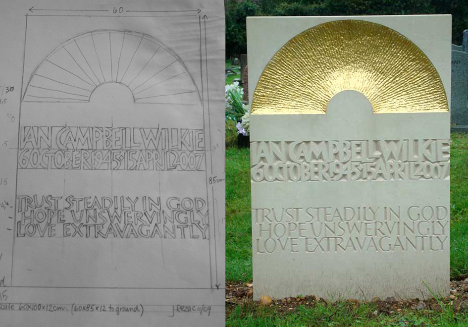
Tim: You mention about doing sketches. Is that how you work the whole time, after you’ve talked to the person who wants the gravestone? In other words, what process do you go through before the stone is cut?
Julie: Well, I thought about what are the most important ingredients about designing and I realised that it is how many restrictions the customer puts on me. I have here, an example: These people had no idea about what they wanted at all and I would say that was hard. When they started out, they told me all about the person who had died. I looked at a lot of photos with the family. She thought she might like something with colour. She, herself, was religious, but his sons were not and they didn’t want something religious, so I just started trying to come up with ideas. She thought she might even like glass in this stone. I thought I could cut it out and then put glass resin in it, so that the light would show through – and I have to say that I was kind of excited about that idea! But, it really was about taking a stab in the dark and trying to come up with something. Often I will make little clay models to try and give them an idea of what it might look like – especially as this lady wasn’t really very creative at all, so I realised that she would have a hard time seeing what that thing could be.
You know it’s always more about layout and that’s what I would say to you - it should be the most important thing to you, if you are going to be a designer..... Someone told me this analogy ... imagine you build a chair; you’ve got to make sure that the chair is good and sturdy and straight and then you put on the upholstery. Likewise it’s the same with letter forms, the curls, and the colour ... that is the upholstery. And so that is always how I think of it and that is how I start.
Julie: I think and to go back to what you asked about what sort of lettering exhibits love, and I think one of the nicest stones I ever saw was in a prairie cemetery in Kansas, and those people were dirt poor; they didn’t have anything. This grave was just a block of poured concrete that they’d made a little form for and then they’d obviously taken little pebbles and written the name of the child – just the name, with these pebbles – into the concrete. It was just so moving, you know. And the dates were 1887 or whatever, which is probably when they were crossing over, but to me, there was so much love in that little stone.
Tim: Julie, as a last question.... are there many other lady stone cutters, such as yourself around?
Julie: Yeah there are more, but you know, we’re kind of a crotchety group, so that we don’t really mingle with each other (they laugh). And I don’t really think it’s competition, but rather they just don’t like to meet together. For example – I think it was about two years ago – I went to a workshop in Ditchley, which was for master letter cutters and I don’t know, there were about ten of us, and you’d think we’d have lots to talk about, but we didn’t and it was just kind of clumsy. I don’t think we were very sociable. I guess I don’t really know any.


